Swit Rebrand
Swit is a collaboration platform that strives to re-humanize work and connect employees in efficient and meaningful ways.
Created as a tool that combined the two most frequently used work functions — chat and task — into a single, unified app, the Swit platform evolved into a true work hub that brings an entire company together by centralizing everything needed for both work and organization management.
As Lead of Design, I was tasked with building out a new visual identity and design system that better aligned the product design and brand identity and reflected the product’s ongoing evolution.
My Role:
— Lead of Design
— Brand Strategy
— Art Direction
— Graphic Design
— Icon Design
— Illustration
— Website Design
Credits:
— Senior Designer & Illustrator (US): Anj Censon
— Graphic Designer & Animator (US): Tristyn Caneso
— Lead of Brand eXperience (Korea): Anna Lee
— Additional Design: Media & Brand Design Team (Korea), led by Ted Sohn
— Web development by Swit’s FE Team (Korea)
— Managing Editor/Content (US): Natalie Litofsky
The Swit Heart
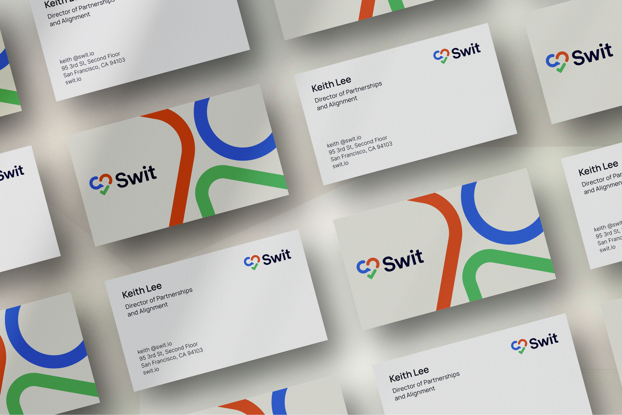
The logo symbol was created by combining Swit’s core functions and value proposition within a heart shape that represents human relationships and a sense of belonging in the workplace — whether in-office, hybrid, or remote.
The logo’s colors align the identity with the product functions — blue for chat, green for task — and reflect a third feature through the addition of Swit Orange: a bright and energetic shade representing connection through interconnectivity, integrations, and plug-ins.
Colors
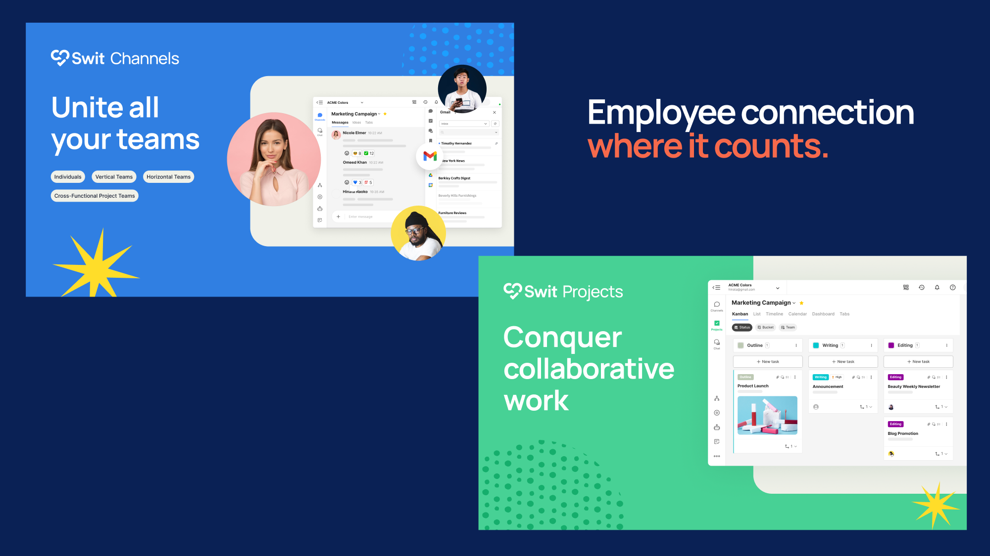
We created a core color palette that enabled us to communicate Swit’s functions and benefits through visual cues. When highlighting a specific feature — chat, task, connection — the appropriate color would play the lead role, while more general messaging or branding features Natural (a soft creamy beige color) or Navy Blue as the dominant color with Swit Orange as the primary accent.
Image and Graphic Treatments
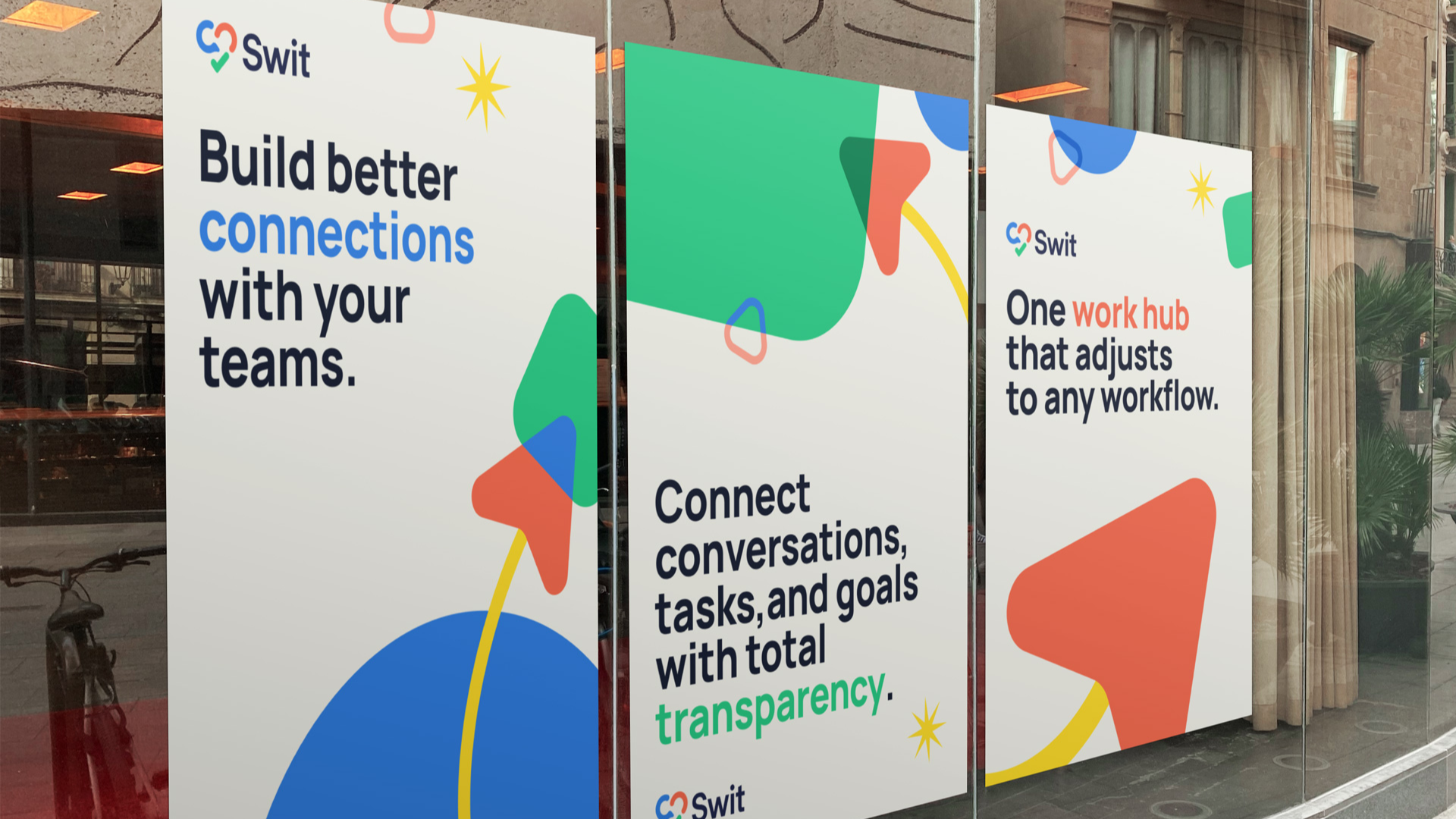
Combining the graphic shapes with photography and UI images allowed us to create lively and engaging collages and image assets.
Graphic Shapes
We rounded out the design language to include a collection of shapes that visualize work processes, customization, and transparency. Individual shapes represent ideas, employees, and teams, while curved, fluid lines symbolize the unhindered flow of information across teams and workspaces.
Website
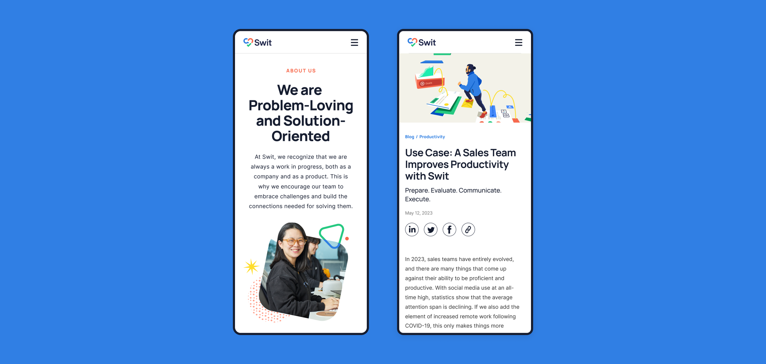
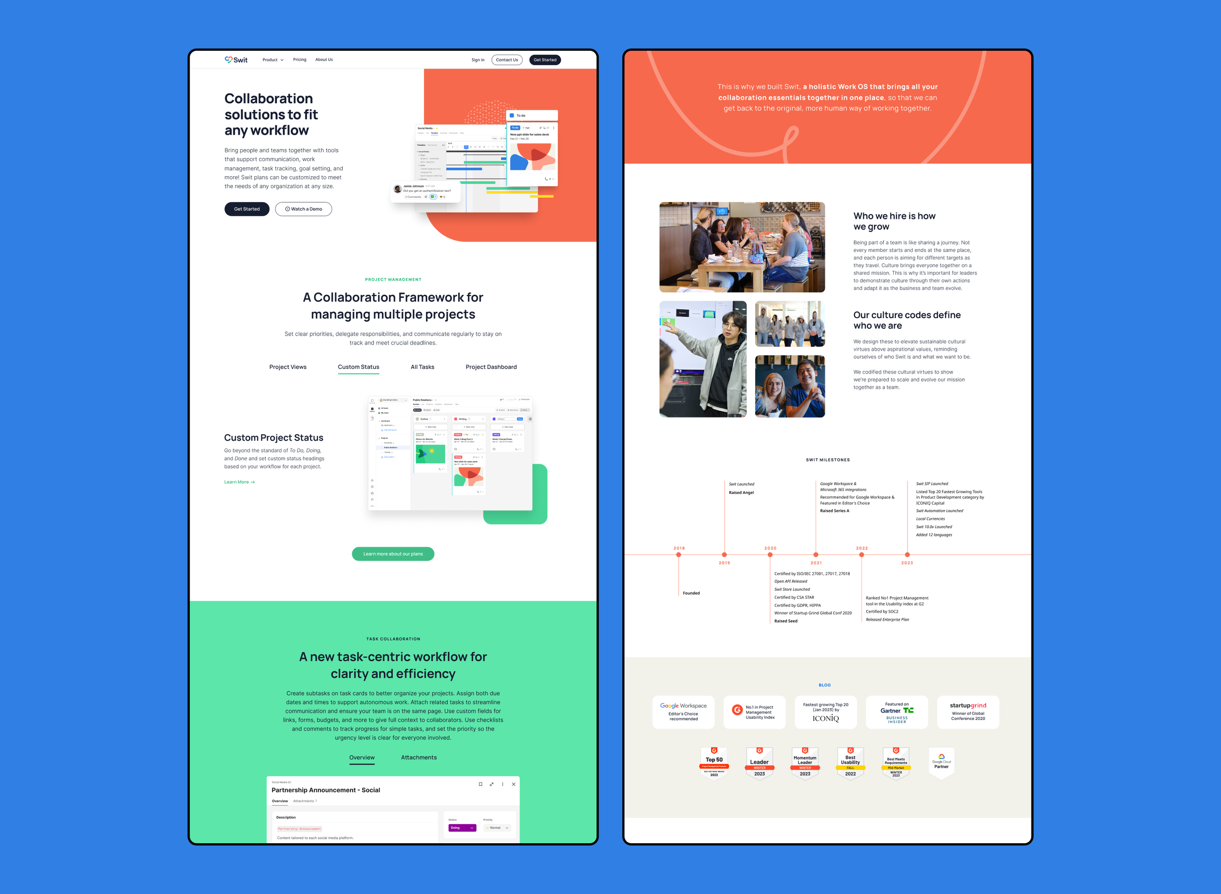
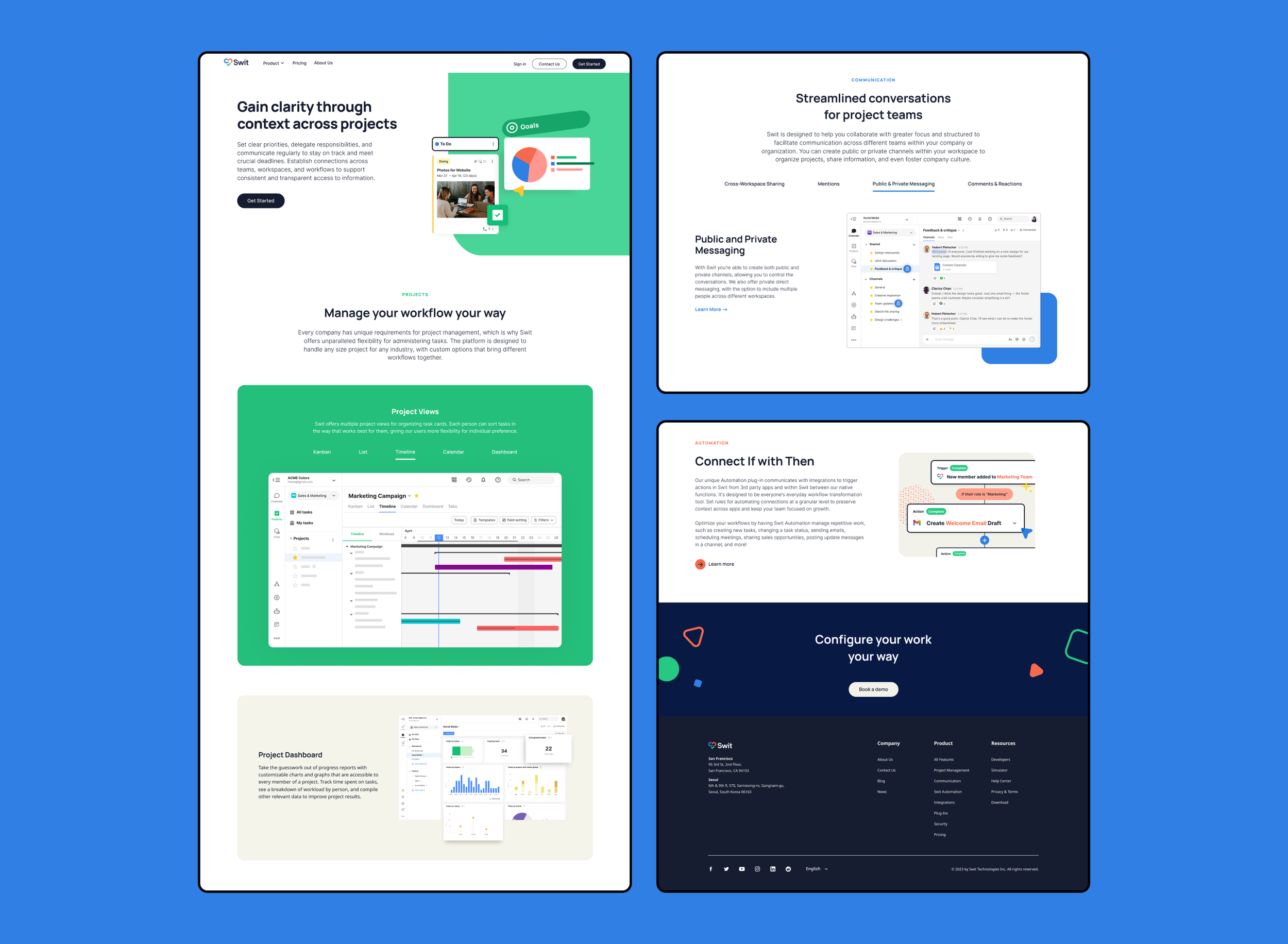
The previous version of the Swit website was heavy on philosophy, thought leadership, conceptual illustrations, and industry jargon. We redesigned the site to clarify the product offering — both Swit’s specific features and functionality as well as the value and cost benefit to users — and improve lead conversion.
Illustration
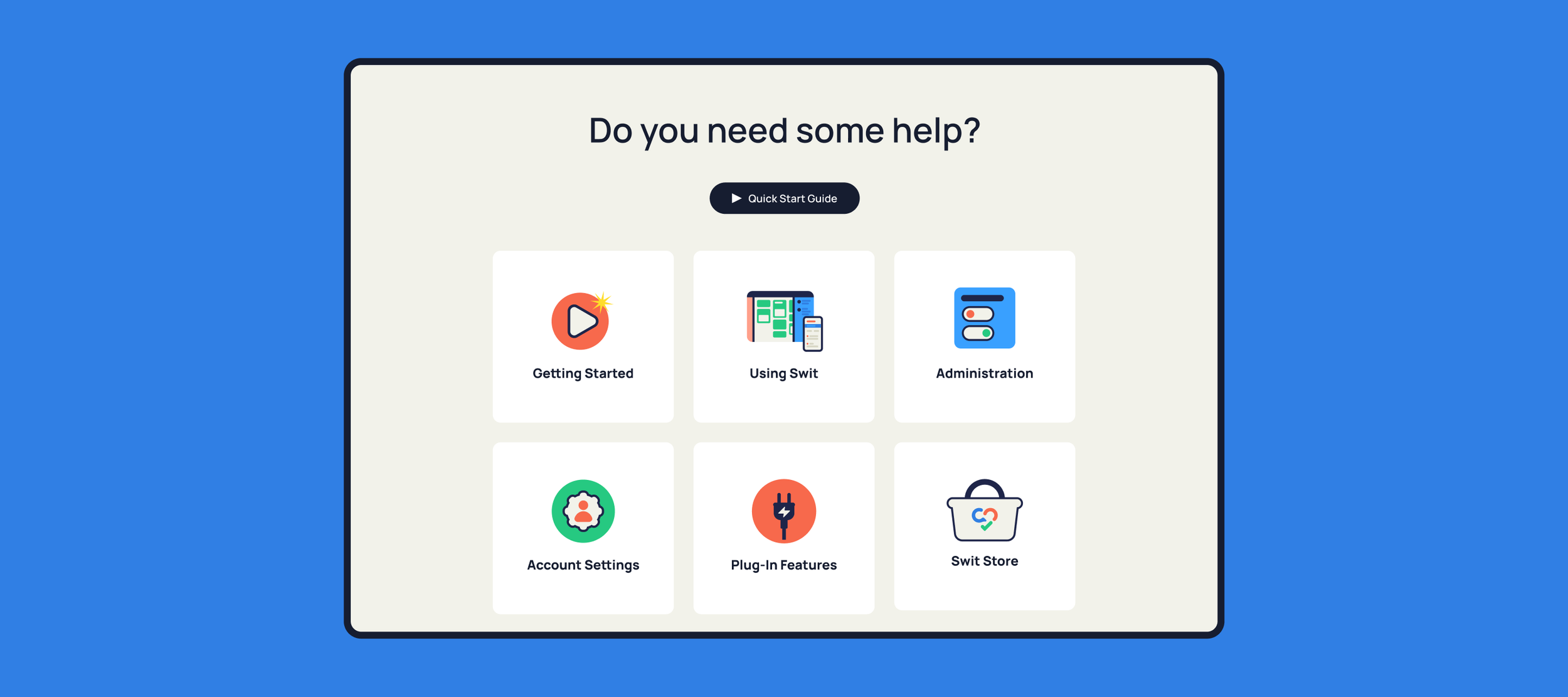
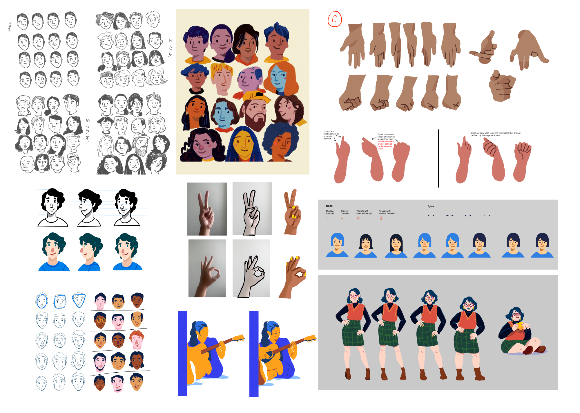
Swit illustrations are approachable and lively, showing everyday people at work, in conceptual and relatable situations. The illustration colors are rooted in the design color system, but extend beyond to provide more flexibility and depth.
My team explored style directions and shared sketches on a FigJam board until we reached a style that was unified, inclusive, and flexible. We documented and articulated the style in detail within the brand guidelines.
The sketches and illustrations presented here were created by myself, Anj Censon, and Tristyn Caneso.

